IDENTITY
A unique logo combined with color scheme, typography, imagery, and design style makes up the brand's visual identity. With all these elements, the logo is what stands out as the brand's visual emblem. It acts as the brand's face, reflecting its core essence and values.
Logo for The Ibsen Club.
Logo symbol for The Ibsen Club, an association to explore Henrik Ibsen's works, mainly for students at UiO and others.
Hospital Clowns are a group of professional performing artists who specialize in working with children in hospitals. The clowns contribute to positive experiences and provide a respite for children and young people in otherwise challenging life situations.

Had great fun designing the car for SYKEHUSKLOVNENE, personalizing it with eye lashes on the front headlights and the large red nose that could attach to the car.
Norfjord Folk High School: As one of my first projects, a fresh new logo was created for Norfjord Folk High School, which is still in use today. The focus was the human element in center, but nature, fjords, mountains, and outdoor sports activities were key themes.
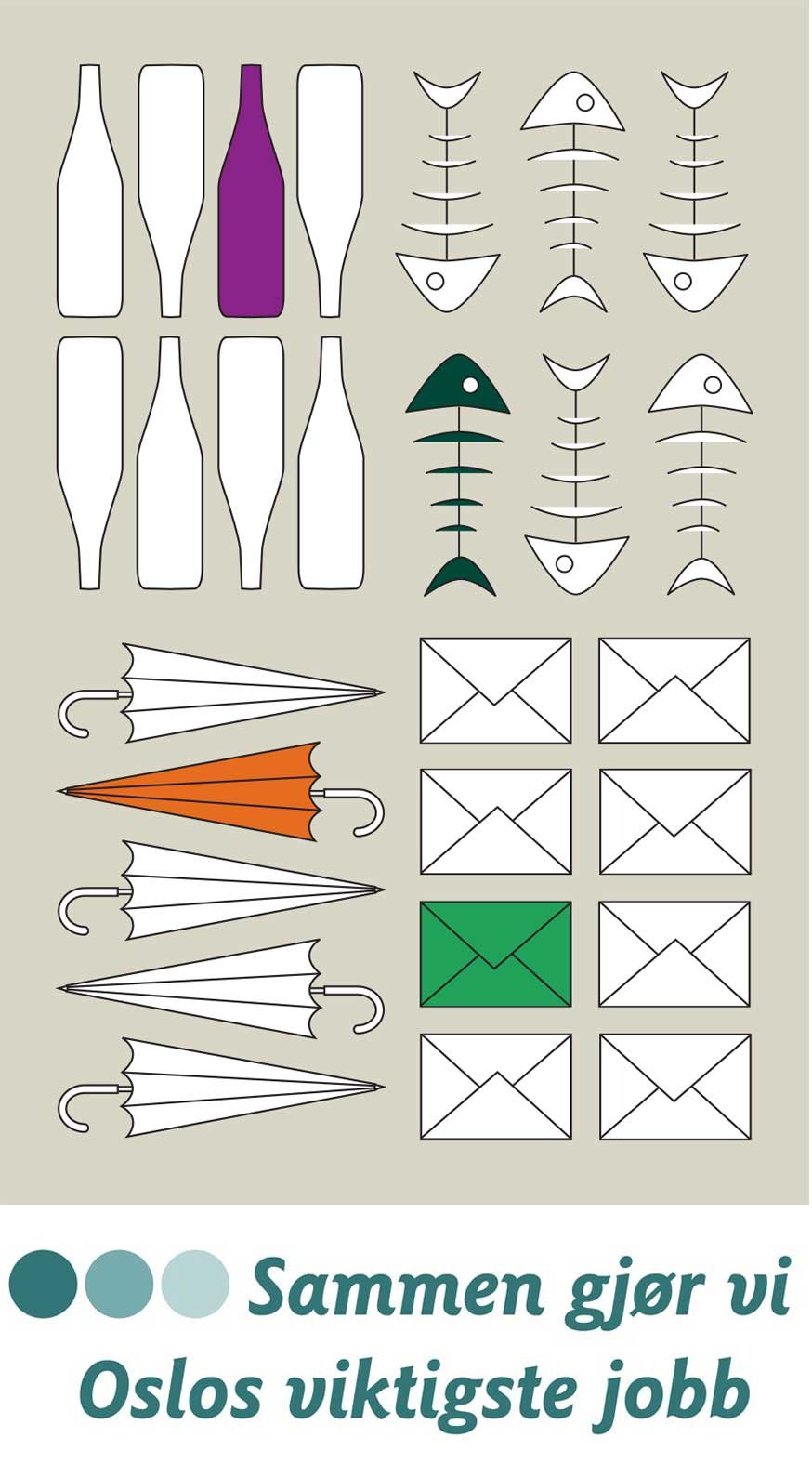
REN – Waste Management Agency, Oslo Municipality: I was part designer (Satchi & Satchi project) for the new graphic profile for REN, including the redesign of the existing slogan 'Together we do Oslo's most important job'. Many elements was made to inform and make people start organizing waste in three different coloured bags.
STRØMPE specializes in socks, tights, leggings, and other accessories. Online store www.strompe.no
The logo was created based on the existing design language of the Health College's website; it was meant to be functional, feminine, inspiring, fresh, and playful. The three core values – quality, flexibility, and closeness – reflect the Health College's offering of online studies, which allow you to take courses from anywhere, inspiring the idea of the red dot symbolizing 'you are here'.
SUM – Centre for Development and the Environment: A research institution under the University of Oslo, operating independently. It was crucial for them to establish a strong, unique profile that could work internationally, while also adhering strictly to the University of Oslo's guidelines.
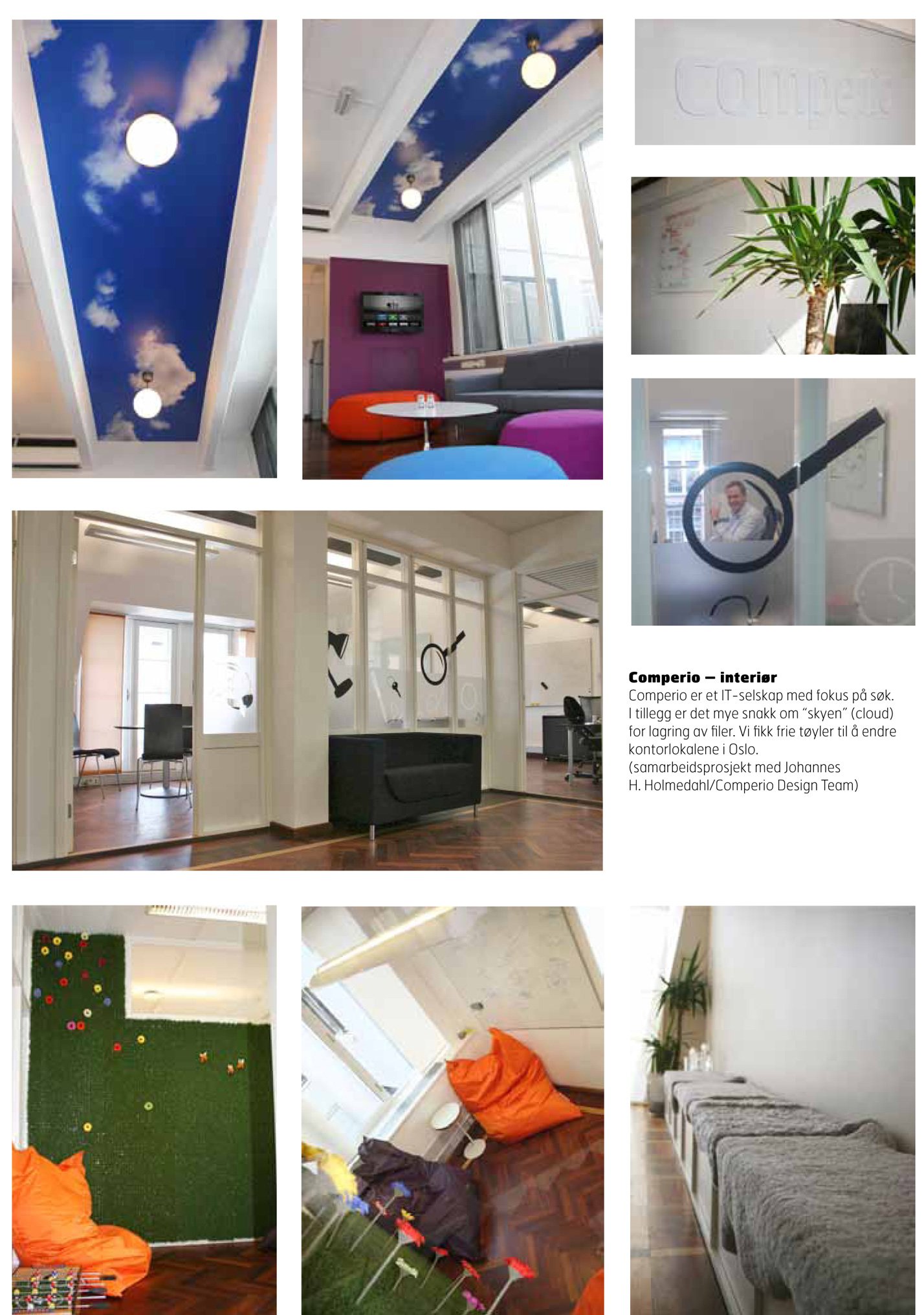
Comperio office: Design search elements incorporated into the interior. There is a lot of discussion about "the cloud" for file storage, which gave the idea of a nice ceiling. (Collaborative project with Johannes H. Holmedahl)
Bergen Global: A joint initiative between the University of Bergen and CMI – Chr. Michelsen Institute.
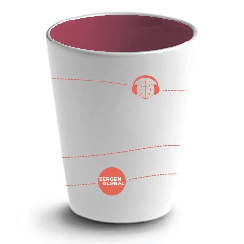
Bergen Global – a coffee mug with design elements for their podcast and breakfast forums.
Din Helse: Logo sketch for Your Health (not used) for a website associated with the Health College. The site provides information and articles on topics such as exercise/nutrition, body and illness, wellness/relationships, and mother/child.

Visually responsible for Logo which has had two shoe stores in Oslo and an online store. Also, collaborated closely with the renowned Camper shoe brand from Mallorca on shop-in-shop arrangements.

Business card Helsehøyskolen: In addition to the original logo, the H-shape was filled with relevant patterns and photos that can be varied. This is intended for creative use in posters, signage, advertisements, etc., and helps enhance the logo's recognizability.

Comperio is an IT company that specializes in search. In addition to a new logo, we developed a graphic element that displays a group of objects when someone searches for 'office,' for example. This element is also used in the interior design.
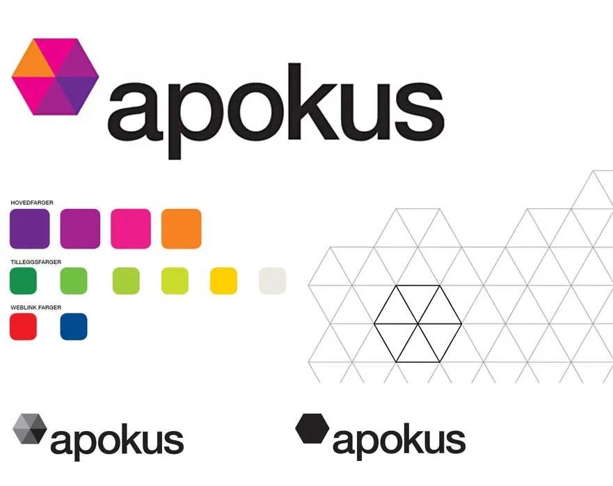
Apokus is a competence center that will deliver learning and development projects to the pharmacy industry. Apokus aims to be an innovative, relevant, and professionally competent environment that simplifies everyday life.

Helsehøyskolen: Stand for educational fair, promoting studies in Thailand.